Categories
Blog Improvement Project Other

Ten Blogs with Great Layout Ideas

In the spirit of Blog Improvement Project, I thought I’d highlight the best book blogs I’ve come across in terms of layout. The followings blogs each have something special, and I thought I’d highlight the things I love about each of them.

Listed in alphabetical order.

1. 1 More Chapter

I love the bookcases round the edges, it is so atmospheric! This site is also really well organised. The tabs along the top for each year are really useful, and the sidebars are packed with everything else you need to know.

2. Beth Fish Reads

Beth has done lots to improve the layout of her blog recently, and I think it looks great. I love the little touches, like a blog roll that displays the most recently updated blogs, and the slide show of her awards. Some clever little ideas!

3. Cornflower Books

This site is so clean and fresh looking. I also like the way that the book reviews are kept on a separate site to free things up a bit.

4. It’s Dark in the Dark

I was impressed by how many extras there are on this blog. There is a book store, and several other items for sale in the sidebar. It also has updates of his Twitter status  – I really should look into signing up to Twitter some time soon.

5. Ex Libris

I love the way this blog is organised. Everything seems to fit perfectly into it’s space. It looks really professional, and the posts are always really well thought out too!

6. Farm Lane Books

I know this is really cheeky, but I’d love you to have a look at my ‘About Me’ page. I found this great widget that displays where visitors have come from on a revolving globe. I think it is beautiful! I found that it slowed down the loading of the page quite a lot, so I moved it to my ‘About Me’ page, so that it didn’t interfere with normal blogging, but I thought everyone should have a look at least once!

7. Fizzy Thoughts

This site is clean and well organised too. I particularly like the ‘now reading’ slide show. A clear indication of which books I’m currently reading is missing from my blog at the moment, so I’m going to try to change this as soon as possible.

8. Papercuts

An example of how the professionals do it. This looks great, but I’m not sure I’d like all the adverts on my blog. I like the way this site feels as though it is just another page in a much larger site. There are so many different things to go and look at from this one page alone.

9. Poodle Rat

I spotted the header for this blog, and just had to share it! It is really clever the way photo is split into three sections – so beautiful!

10. Tripping Towards Lucidity

I like the way this blog makes full use of both sidebars. It is really easy to see which books have been read recently, or are coming up soon. Everything you’d ever want to search for is easy to see straight away.


There are lots of other great blogs out there, but I didn’t want to carry on listing them for ever!

Writing this post has given me some great ideas for improving my own blog, and I hope to slowly add some of these over the coming weeks.

Have you seen a blog with a really great layout? If so, leave a comment, and tell me which features of it you really love.

Categories
Other

Have you heard of a blook before?

I’ve just come across a great new word!

BLOOK

The word was originally used in the 1990s to describe imitation books – things that look like a book, but contain no text. These were often used for advertising, packaging, toys or displays, and examples can be found as far back as the 16th century. The word was formed by shortening the two words: BOOK and LOOK, ie. looks like a book.

Do you think this counts as a blook?

More recently the word has taken on new meanings. It is often used to refer to books which are serialized on blogs. Increasingly people are self-publishing their own books, a chapter at a time on the internet. Readers can then subscribe to the book using their RSS feed.

It can also refer to the reverse of this situation; where people are payed to write books about their blogs.

Blook was short – listed for the Guardian ‘Word of the Year’ Award in 2006.

I’m sure that there will be lots more blooks in years to come, and one day I may get round to reading one!

Categories
Other

Have you ever found anything interesting in a book?

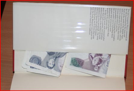
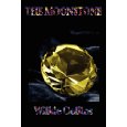
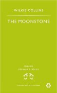
I’ve just found £35 inside the dust jacket of a second hand book I bought. They are old notes, not in circulation any more, but hopefully I’ll be able to swap them for useable notes at a bank.

Have you ever found anything interesting inside a book you’ve bought?

Categories
Meme

Weekly Geeks – Judge a book by it’s cover!

This weeks Weekly Geeks task is to Judge a Book By Its Cover!

The Task:

Pick a book–any book, really–and search out multiple book cover images for that book. They could span a decade or two (or more)…Or they could span several countries. Which cover is your favorite? Which one is your least favorite? Which one best ‘captures’ what the book is about?

I’ve chosen the book I’m currently reading: The Moonstone by Wilkie Collins. So far, I’ve only read about a quarter of the book, so I may not be able to give an accurate reflection of the whole book, but will judge the cover based on my first impressions.

I found 104 different covers on Library Thing here. So I had a large number to chose from!

I picked out some of the more interesting ones below:

1966 Paperback
1966 paperback

This is one of the oldest paperback covers I could find. It looks very dated to me, and I don’t think I would ever pick this up on impulse in a book shop. It makes it look like it’s for children, and not the mystery book it is.


1992 paperback
1992 paperback

I haven’t read the whole book, but this seems like an inappropriate cover. This looks like the cover for a romance novel. The Moonstone is billed as the first detective novel, and I think it needs a darker, more atmospheric cover. I would pick this book up, if I was in the mood for a romantic piece of historical fiction, but think I would have been surprised by the book’s contents.


1998 paperback
1998 paperback

This cover makes the book look like historical fiction, again with a romantic theme. I don’t particularly like the picture, and wouldn’t pick it up on impulse, although it does have a Victorian feeling about it.


2008 paperback
2008 paperback

This book looks dark and atmospheric, but for some reason the purple makes me think that this book is aimed at teenagers – I have no idea why I think that! Maybe it’s the typeface of the title too? Does anyone else think that? I haven’t finished the book, but I thought that The Moonstone was  based upon the theft of a stone. This cover implies that it is more of a murder mystery. I don’t think I’d pick this copy up either. The cover makes it look like a basic book, without enough depth for me.  


2008 paperback
2008 paperback

Again, this book looks like a teenage fiction book. I prefer the moonstone being on the front, but in the first chapter the stone is described as tear-drop shaped, so unless it gets cut down later in the book, then I think this is a poorly designed cover.


2003 Paperback
2003 paperback

 This is the only cover that I think I would pick up, on impulse, in a book shop. Dark, atmospheric and full of mystery, this book looks like my sort of thing. It also seems to most accurately reflect the book’s content.


This has been a really interesting exercise for me. I know that I am strongly influenced by a book’s cover. I have bought several books just because their striking cover has drawn me to them – black page edges are a particular weak spot for me! The majority of books that I buy are bought on other people’s recommendations, so I often do not see the cover before it arrives through my letter box. This means that their design does not matter as much as it would have done a few years ago, when the majority of my purchases were made on impulse in a shop. I rarely receive a book with a cover that does not appeal to me, so book designers are obviously very good at knowing their audience.

The massive variety of covers for the same book has opened my eyes to the fact that in future I should be less influenced by the picture on the cover.

 
Finally, this is the cover I’m reading, so I thought I should include it! It is very boring, and gives you no idea as to the content of the book – perhaps all books should have plain covers, so we’re not influenced by the designs on the cover?


Which of these covers do you like best? If you’ve read The Moonstone, which one do you think most accurately reflects the plot?

Categories
Other Uncategorized

Snow!

It’s been snowing here, so we’ve been having fun building snowmen!

Categories
Chunkster Richard and Judy Book Club

The 19th Wife – David Ebershoff

The 19th Wife is based around a polygamous Mormon sect. The book is split into two distinctive parts. The first begins in 1875 and follows Ann Eliza Young, the nineteenth wife of Brigham Young, the second Prophet of the Mormon Church. Unsatisfied with his treatment of her, she separates from him, and then leads a crusade to end polygamy in America.

The second is basically a murder mystery. Twenty-year-old Jordan discovers that his father has been murdered, and his mother is accused of shooting him. Jordan was expelled from the  Mormon sect at the age of fourteen, when he was discovered holding hands with one of his step-sisters. He returns to Utah to visit his mother in jail, and begins to uncover many secrets within his polygamous family.

Other than the theme of polygamy there was nothing to link the two stories; as the book is a whopping 606 pages long, I think that it could have benefited from being split in two separate books. The writing styles were very different, and I think they will appeal to different people. I much preferred the modern, murder mystery, as it had more pace and intrigue. The character of Jordan was well drawn, and I had lots of empathy for him. The ending was reasonably satisfying, and this section works well as a thriller with a twist.

I found the historical section to be quite dry, and by the end of the book I had lost interest in it. The large number of footnotes, and other historical references were distracting, and it was difficult to know which sections were factually accurate, and which were fiction. The characters became lost in the data, and it became more like a text book than a novel.

Overall, there was a lot of interesting information about life within a polygamous family, but it lacked that special spark.