This weeks Weekly Geeks task is to Judge a Book By Its Cover!
The Task:
Pick a book–any book, really–and search out multiple book cover images for that book. They could span a decade or two (or more)…Or they could span several countries. Which cover is your favorite? Which one is your least favorite? Which one best ‘captures’ what the book is about?
I’ve chosen the book I’m currently reading: The Moonstone by Wilkie Collins. So far, I’ve only read about a quarter of the book, so I may not be able to give an accurate reflection of the whole book, but will judge the cover based on my first impressions.
I found 104 different covers on Library Thing here. So I had a large number to chose from!
I picked out some of the more interesting ones below:
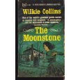
This is one of the oldest paperback covers I could find. It looks very dated to me, and I don’t think I would ever pick this up on impulse in a book shop. It makes it look like it’s for children, and not the mystery book it is.
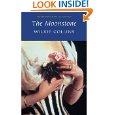
I haven’t read the whole book, but this seems like an inappropriate cover. This looks like the cover for a romance novel. The Moonstone is billed as the first detective novel, and I think it needs a darker, more atmospheric cover. I would pick this book up, if I was in the mood for a romantic piece of historical fiction, but think I would have been surprised by the book’s contents.
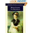
This cover makes the book look like historical fiction, again with a romantic theme. I don’t particularly like the picture, and wouldn’t pick it up on impulse, although it does have a Victorian feeling about it.

This book looks dark and atmospheric, but for some reason the purple makes me think that this book is aimed at teenagers – I have no idea why I think that! Maybe it’s the typeface of the title too? Does anyone else think that? I haven’t finished the book, but I thought that The Moonstone was based upon the theft of a stone. This cover implies that it is more of a murder mystery. I don’t think I’d pick this copy up either. The cover makes it look like a basic book, without enough depth for me.

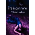
Again, this book looks like a teenage fiction book. I prefer the moonstone being on the front, but in the first chapter the stone is described as tear-drop shaped, so unless it gets cut down later in the book, then I think this is a poorly designed cover.

This is the only cover that I think I would pick up, on impulse, in a book shop. Dark, atmospheric and full of mystery, this book looks like my sort of thing. It also seems to most accurately reflect the book’s content.
This has been a really interesting exercise for me. I know that I am strongly influenced by a book’s cover. I have bought several books just because their striking cover has drawn me to them – black page edges are a particular weak spot for me! The majority of books that I buy are bought on other people’s recommendations, so I often do not see the cover before it arrives through my letter box. This means that their design does not matter as much as it would have done a few years ago, when the majority of my purchases were made on impulse in a shop. I rarely receive a book with a cover that does not appeal to me, so book designers are obviously very good at knowing their audience.
The massive variety of covers for the same book has opened my eyes to the fact that in future I should be less influenced by the picture on the cover.
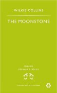 Finally, this is the cover I’m reading, so I thought I should include it! It is very boring, and gives you no idea as to the content of the book – perhaps all books should have plain covers, so we’re not influenced by the designs on the cover?
Which of these covers do you like best? If you’ve read The Moonstone, which one do you think most accurately reflects the plot?
17 replies on “Weekly Geeks – Judge a book by it’s cover!”
I rather like the close up on the striped bodice but it says “Victorian fiction” more so than romance. None of the covers say detective fiction to me.
I think I like the one you do, the second to last one with the atmospheric art on the cover.
You raise a good point about getting books through recommendations rather than browsing these days. I do the same. I don’t ever go and browse the library any more – I find the books I want in the online catalogue and put a reserve on them. So I certainly never know what cover I’m going to get until I pick them up. All the same, I really enjoy looking at pretty covers on the computer. I even have a folder of covers for my ebooks so I can still browse them.
Certainly covers play an important part in why we choose a book, and we mostly expect graphics don’t we
I also like the same one you do.. I would buy that cover out of all the choices. 🙂
Having read this book, I agree with you…the 2003 cover seems to me to be the best “descriptor” for the book; and it is the one that appeals to me the most. I readily admit, I am completely influenced by beautiful covers (and likewise, if a cover doesn’t appeal to me, I usually don’t buy the book!).
Not knowing anything about this book I actually really like the cover with the purple. That is the first one that caught my eye.
I liked the dark, atmospheric one. Yet to read this book!
Covered!
I love this book! I actually like the copy you’re reading best, but If I didn’t know anything about the book, I don’t think it would convince me to pick it up.
I hate those green Penguin covers. I agree, they’re so boring. I actually like being influenced by the cover 😛 Mostly I like having some nice art to look at. My favourite is the second to last one.
I love that 2003 cover!
Ooh, the lady in blue with the purple background is the one that caught my attention best!
I do believe you are spot on with this one. Having read the book, it does reflect scenes from the book, and also reflects the right mood. It definitely is not a YA book, and I don’t think it adequately classified as historical fiction. What a great exercise!
My old version is just plain blue. I will be reading probably for spring reading challenge. I like the 2003 paperback cover – gives it an ethereal quality.
One of my favorites! And I would pick up the same cover you chose.
So are you saying the book is boring like the one in the cover your reading? Sorry to hear that. I kinda like the teenaged looking titles but I like teenage books.
No, just the cover is boring – the book is really good!
I like the Penguin black classic one the best too. And I agree that the third to last one looks too modern and murder mystery-ish with that cover. Hard to imagine it’s a classic looking like that. I’ve only read The Woman in White by Collins but hope to read this one sometime.